Improve layout and style of forms and make them responsive. #529
Description
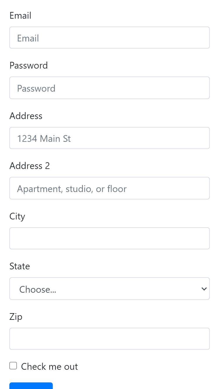
Improve the layout of forms by stacking labels and inputs instead of putting them one next to the other(which is the current layout). This may require to remove the "blue label" style in our forms.
This layout will persist on small screens, which will make the forms responsive.
We expect to achieve something similar to :
Start applying this change to the time-clock page, and then progress to:
- time-entries modals
- reports control inputs
- activities forms