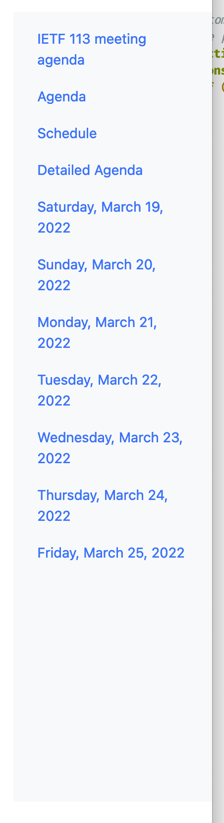
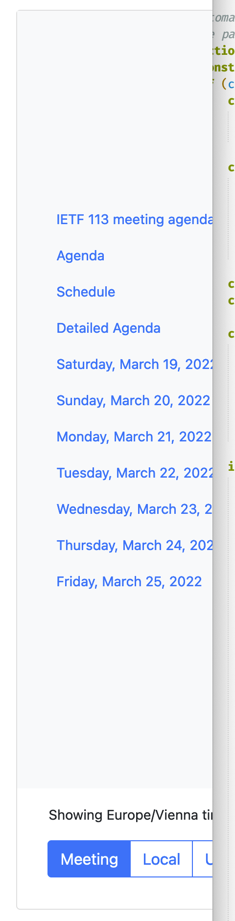
What happened?
There were some recent changes in feat/bs5 that allowed pulling in extra content (mainly for the agenda page).
The resulting DOM structure for the righthand-nav now seem somewhat odd. There are card elements in there whose purpose I don't understand and that add add visual elements (borders, spacing) that wasn't there before.
More importantly though, what's being added to the nav isn't actually shown in a useful way, as it's being horizontally truncated. See below for a comparison between 3234f1a (top) and 3619d3b (bottom, current):
What browser(s) are you seeing the problem on?
Not Applicable
Code of Conduct
What happened?
There were some recent changes in feat/bs5 that allowed pulling in extra content (mainly for the agenda page).
The resulting DOM structure for the righthand-nav now seem somewhat odd. There are
cardelements in there whose purpose I don't understand and that add add visual elements (borders, spacing) that wasn't there before.More importantly though, what's being added to the nav isn't actually shown in a useful way, as it's being horizontally truncated. See below for a comparison between 3234f1a (top) and 3619d3b (bottom, current):
What browser(s) are you seeing the problem on?
Not Applicable
Code of Conduct